Minimalism and simplicity aren’t exactly the same thing, but this Season will be encompassing these two styles. Look for clean, sharp lines, crisp and well-blended color palettes and an overall sense of openness and freshness in each room. Most rooms will aim for an uncluttered appearance, with one pop of color as a special fun accent.
This Season, perhaps more than any other, will help you use your creativity as you try to mix and match gorgeous materials to achieve the famous minimalistic look. You’ll have to make some tough decisions when it comes to patterns and colors, as to not overpower the space, and make full use of your design experience.
Let’s dive in to some beautiful examples created by our artists!
Bedroom Galore
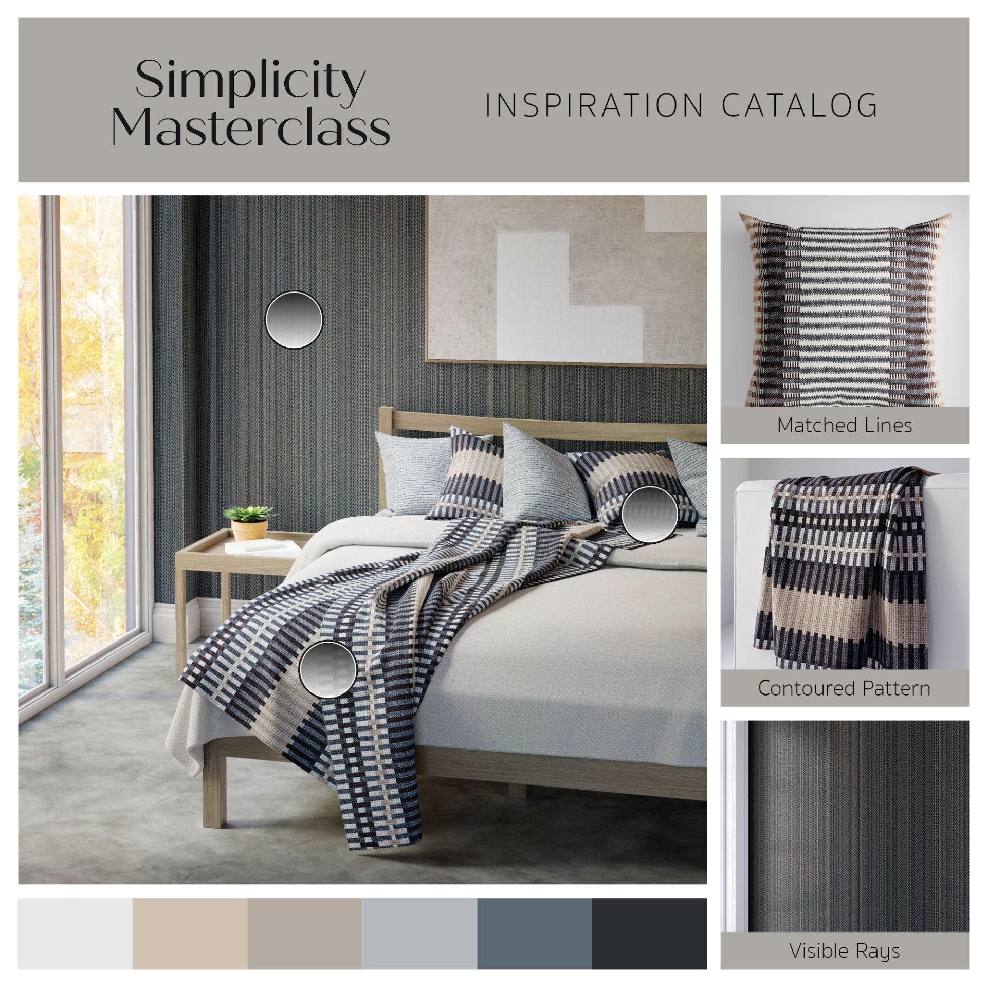
You can clearly see the harmonious way the beiges, soft browns and wooden tones work well together here. Our artists chose a beautiful patterned wall paper and flooring to show you that “simplicity” does not automatically translate to “without texture”! Texture can still thrive in this style – as long as its colors are matching with the rest of the room. Another clever detail is the soft brown of the picture playing off the similar color in the striped throw and pillows. We live for a little harmony!
Cozy to the Max
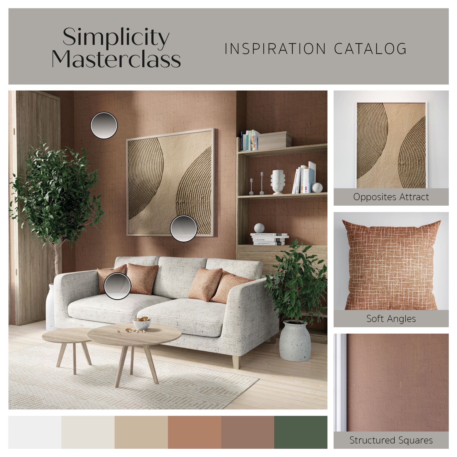
If you were worried about having to choose a neutral color palette for an entire Season, we hope this room helps you relax. These beautiful earth tones, almost copper in their redness, are here to show you that you can choose any color as long as you incorporate it in other aspects of the decor. See this striking wall color for example – it plays off perfectly with the pillows, the wall art and the wooden furniture. The Sofa’s greyer palette ties in with the beautiful vases and carpets. Our artists wanted to showcase how cleanliness and simplicity can go hand in hand with bolder, warmer tones! We think they got it right, don’t you?
Song of the Raven
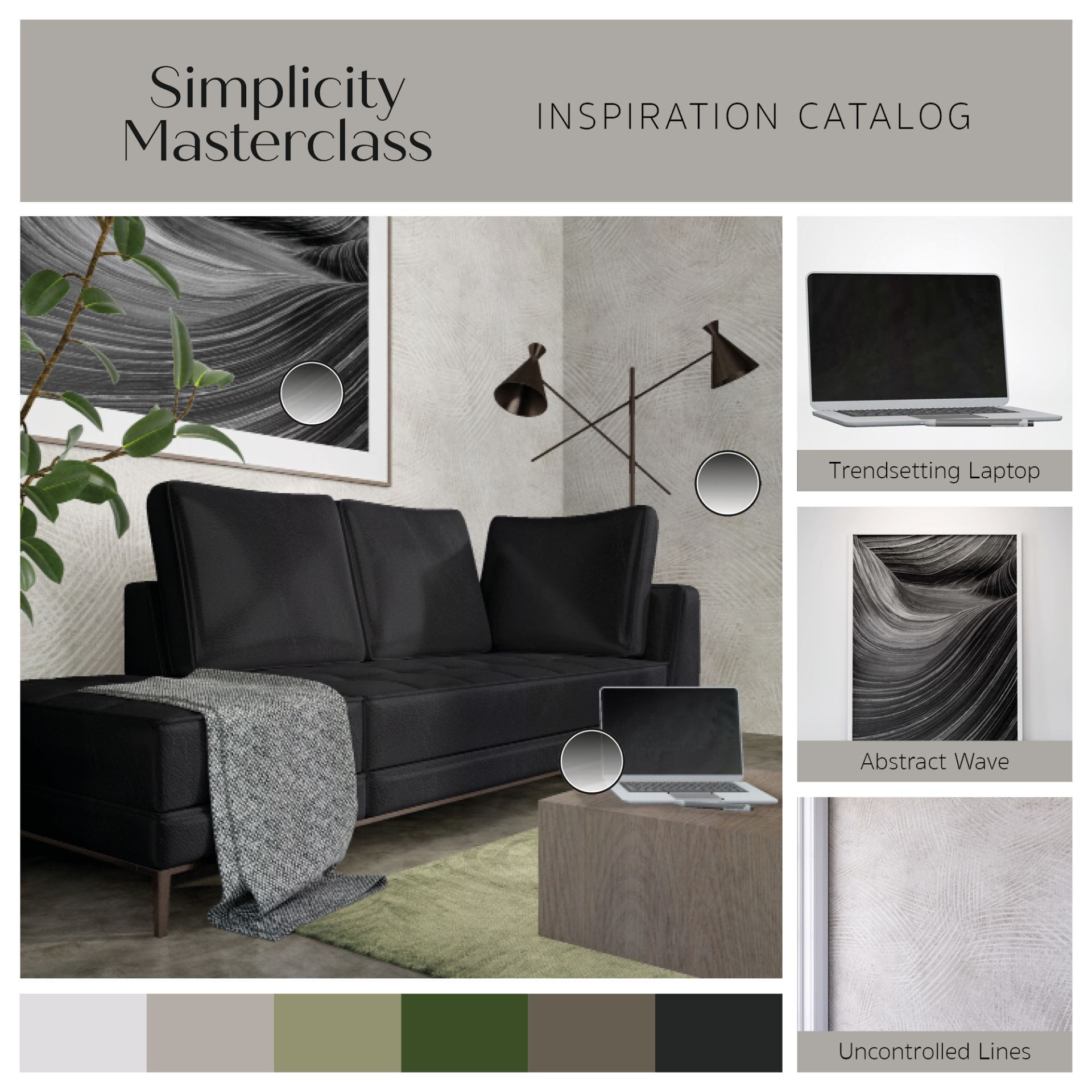
Admittedly, when most people think “minimalistic”, their minds wonder to white and black designs. There’s nothing wrong with those! Some of the most classic, beautiful designs can incorporate stunning black furniture and wall art, like this one! Notice how our artists decided to steer away from the stark (and familiar) contrast of white and black, but chose to lend different asppects of this room to browns, wooden tones, greys, and even a hint of muddied green in the carpet. You still get a very modern feel from the room – but with a bit of added warmth and coziness thanks to the wood and texture.
Dream Kitchen
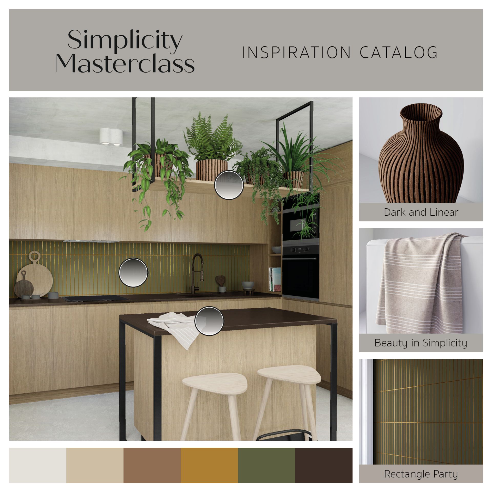
Our last example showcases a bright and open kitchen with warmer tones. Classical minimalism would probably be bewildered at some of the choices here – textured cabinets? Textured ceiling? Striped vases? Hello! Where are the clean whites we were promised? This was done purposefully to remind us all that this Season has to do with simplicity just as much as it has to do with minimalism. Simplicity doesn’t mean wiping everything away until it’s completely barren – it’s about creating a harmonious design that’s pleasant to the eye. This (slightly busy) kitchen proves that!
Join us on this beautiful Season and tune in weekly for great design lessons by the Redecor pros themselves! Class is officially in session!


